Cleare
BRAND IDENTITY | DECK PRESENTATION
Cleare is a revolutionary tech solution that is transforming the daycare industry. By empowering home and center daycare owners to streamline their business operations and optimize the quality of care they provide, Cleare is helping these providers save time and resources, while also providing a better experience for parents and children. With its main mission to take the daycare industry paperless, Cleare is making a real difference in the lives of daycare providers and the families they serve.


Brand Architecture
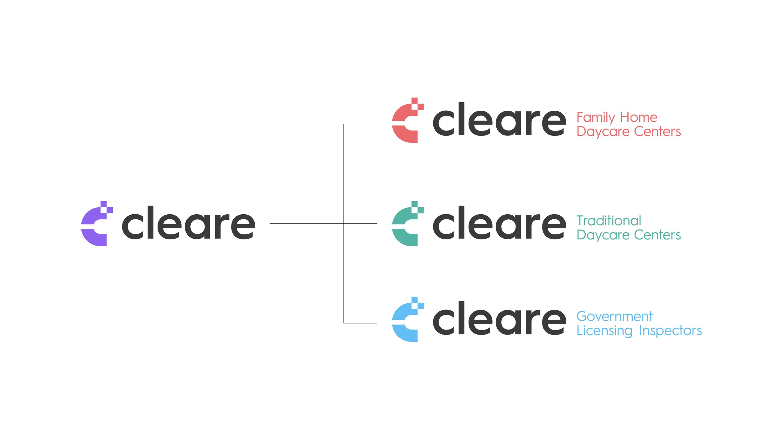
Cleare has adopted a monolithic brand architecture approach, which means that specific color palettes clearly distinguish each division of their business. For instance, the "Family Home" daycare providers are represented by a pastel red color palette, while "Traditional" daycare clients are represented by a teal color palette. In addition, the government licensing division of the business, which caters to b2b clients, is represented by a light blue palette. This clear separation of colors allows for easy recognition and distinction for clients, helping to create a cohesive and organized brand image for Cleare.

The Results
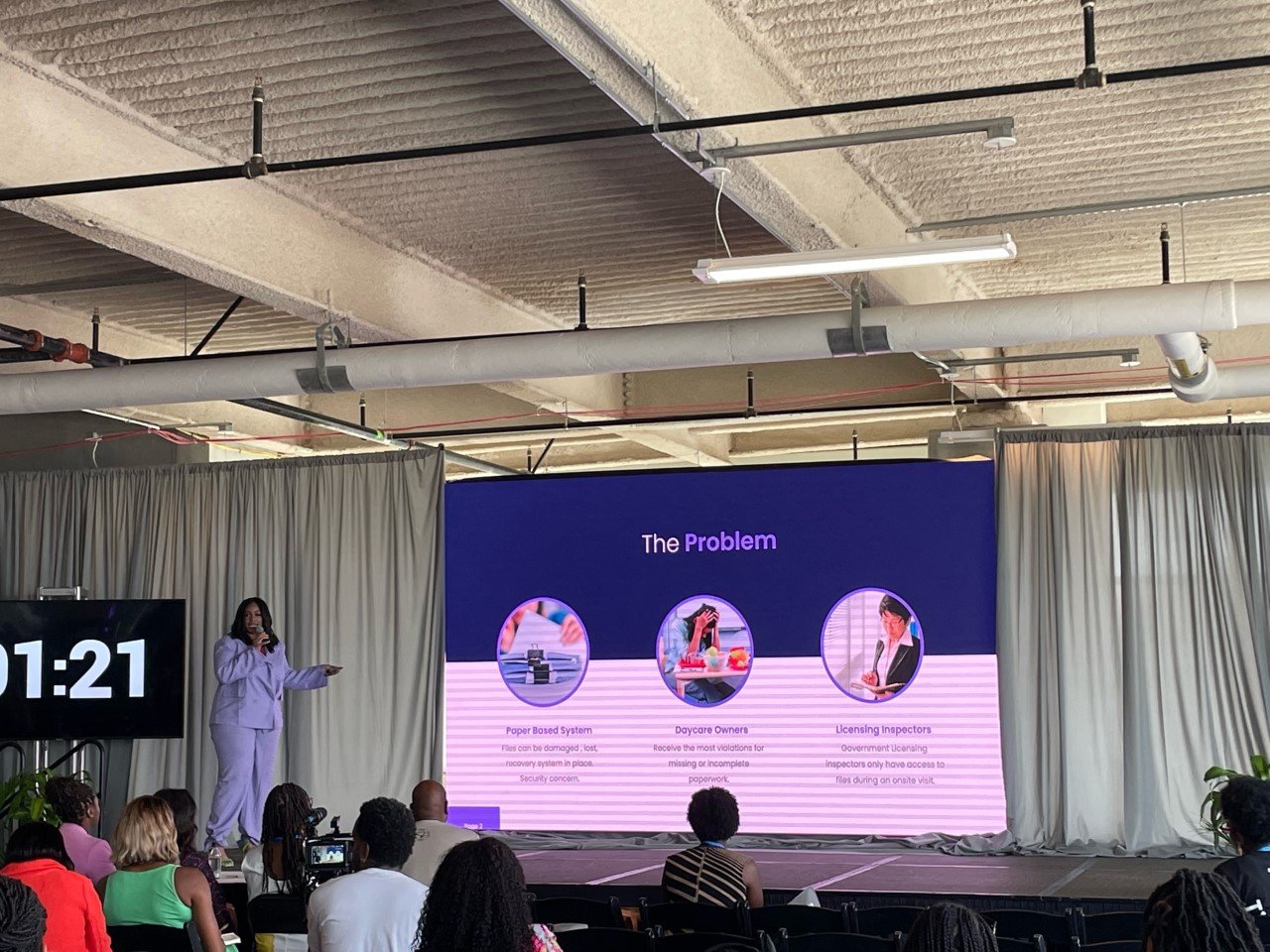
Tisia Saffold, the founder & CEO of Cleare, recently won a pitch competition thanks to her impressive business knowledge and the professional brand identity and pitch deck design created by JUP Design Studio. Using these tools, she was able to effectively communicate her vision for Cleare and convince the judges to award her a $20,000 check. This funding will allow Saffold to invest in the development of her software and take the next steps toward achieving her goals for the company. Cleare also went on to be accepted into Amazon’s accelerator program and gained a $225,000 investment.


